
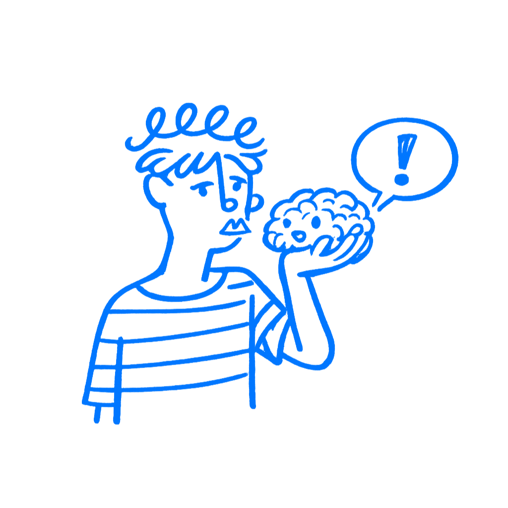
Your Mind Lies to You
How the brain defends your work while pretending to evaluate it
TL;DR: The longer you work on something, the less clearly you see it. Familiarity, overconfidence, and false understanding make your own design feel better and clearer than it really is.
You have been inside the design file for too long. You know where everything is. You know why it is there. You know which version lost three rounds ago and why this one stayed. So when you look at the screen now, it feels clear. That feeling is dangerous, because it is not proof. It comes from exposure.
I still catch myself doing this. A screen starts to feel good just because I stopped having to work to understand it.
It feels better because it feels easier
The brain likes things that are easy to process. That is the core problem here. Familiar things move through the mind with less effort, and that ease gets mistaken for quality. Rolf Reber, Norbert Schwarz, and Piotr Winkielman put it plainly: “The more fluently perceivers can process an object, the more positive their aesthetic response.” That is processing fluency. It is not truth or clarity. It is ease.
That matters more in design than people admit. You keep opening the same file, the same screens, the same flow. You stop needing to work to understand it because your brain already knows the route. The work starts to seem better because you got faster at reading your own intentions.
Leonid Rozenblit and Frank Keil found something close to this in a different form. People thought they understood ordinary objects far better than they really did, right up until they had to explain them step by step. The feeling of understanding was carrying too much of the load. Designers do a version of that with their own interfaces. The screen seems obvious, and then a new person touches it and the whole thing falls apart.
You can see this in small ways. A label feels clear until you have to say what it means without using the rest of the screen as backup. A flow feels simple until you have to explain what happens next at each step without leaning on memory. Familiarity keeps patching the gaps for you.
What Google Wave looked like from the inside
In May 2009, Google announced Google Wave and the room loved it. The product mixed email, chat, live editing, and social updates into one thing. The people building it were not fools. Lars and Jens Rasmussen had already built Google Maps. They knew how to ship hard products.
Then Wave opened to 100,000 users in September 2009 and normal people hit a wall. They did not know what it was for. The product asked them to learn a new model all at once. No familiar starting point. No simple handle. People opened it, looked around, and left. Google stopped active development in August 2010.
This is the part that matters here. Wave did not fail only because it was ambitious. It failed because the people inside it could still read it. They had spent so long with the thing that the product looked more legible to them than it really was. They were living inside a version of the product that users never got.
That is why overfamiliarity is so dangerous in design work. It can make you proud of the wrong thing. It also makes you lose track of where the meaning is coming from. The screen gets credit for understanding that your own head is supplying.
What to check
Before you trust your own read on a design, ask a harder question: does this seem clear because it is clear, or because I already know it?
That question is not magic. It just stops you from treating your own ease as evidence. If you want to make it concrete, step away from the file and come back later with one job only: note the first place where you start filling in meaning from memory instead of from the screen. That is usually where the trouble begins.
What you need there is not more confidence. You need less trust in the comfort of your own familiarity.
Another good check is to narrate the screen out loud as if you were seeing it for the first time. What is this page for. What can I do first. What happens after I click this. The first place where that narration gets muddy is usually not a speaking problem. It points to a design problem. I have had perfectly neat screens fall apart the second I tried to do that honestly.
What outside eyes are for
Justin Kruger and David Dunning are usually quoted for the obvious point, that people who know little can misjudge themselves badly. The part that matters more here is the other side. People with real skill can also lose sight of what is actually visible to everyone else. Once you know the logic, the labels, the edge cases, and the history behind a screen, it gets hard to remember how it feels to see it for the first time.
That is the problem underneath this whole chapter. Familiarity makes the screen seem better than it is. The illusion of explanatory depth makes it look clearer than it is. And once you are already leaning toward the belief that it works, Raymond Nickerson helps explain the rest: the mind starts reading evidence in a way that protects that belief. You do not only know too much. You start interpreting what you see through that extra knowledge.
That is why outside eyes matter. Not because your judgment is useless, but because it is no longer fresh. Other people hit the spots your own brain has been smoothing over. They get stuck where you no longer notice a gap. They ask about the part that still makes sense only because you already know what it means.
At that point, you are not really seeing the screen anymore. You are seeing the version your brain learned how to read.
