
Intuitive Design Is a Lie
Why intuitive just means familiar
TL;DR: Intuitive means learned, not obvious. Users navigate your product by matching it to patterns they already know. If those patterns are missing, nothing feels intuitive. It just feels like your problem to solve.
“Intuitive” is the most dangerous word in a design review. Not because it’s wrong. Because it sounds right. It describes a feeling you have about the design, not a fact about it. And once it’s said, the conversation stops.
How memory builds what we call intuition
In 1932, Frederic Bartlett ran an experiment that seems simple and ends up being kind of devastating. He gave British participants a Native American folk tale, “The War of the Ghosts,” and asked them to recall it later. They all got it wrong. Not in small ways. References to spirits vanished. Cultural details that made no sense to them got swapped out for things that did. A character following tribal duty became a character caring for an elderly relative. The story transformed, and not randomly. It transformed toward what each person already knew about how stories work.
Bartlett called these organizing structures schemas. His point was that the brain doesn’t record experience like a camera. It filters everything through what it already holds, and it rebuilds the memory to fit. You remember the version that makes sense to you. Not the version that actually happened.
This matters for design in a pretty direct way. Users don’t experience your interface fresh. They arrive carrying every other interface they have ever used. They filter your product through all of that and rebuild it to fit what they already know. When it fits, the experience feels effortless. When it doesn’t, things get slow and frustrating and confusing.
Working memory is small. Research puts it at roughly four items at once, with information dropping out quickly without active refreshing. Every unfamiliar element in your interface lands there on its own, competing for that same cramped space. That is why new things feel hard. Not stupidity. Architecture. Schemas are the brain’s answer to that. A schema bundles a whole pattern into a single retrievable unit. Once it is learned well enough, it loads into working memory as one thing instead of many. John Sweller , who built cognitive load theory out of years of research, described schemas as “sophisticated structures that permit us to perceive, think, and solve problems” because they route around the working memory bottleneck entirely.
That routing is what we call intuition. It’s not something the design has. It is a report from memory.
The expert’s invisible advantage
Think about a commercial pilot in a modern cockpit. Hundreds of switches, gauges, dials, buttons, and warning indicators. Objectively one of the most complex interfaces a human operates. And yet a trained pilot reads it in seconds, moves without conscious calculation, knows without thinking. Put a student in that same seat and they are lost in thirty seconds. The cockpit has not changed. What changed is the pilot has spent thousands of hours building schemas for every instrument cluster, every procedure, every failure pattern. Information arrives as packaged wholes. The student has none of that.
Gary Klein spent years watching how firefighters and military commanders actually make decisions under pressure. Traditional decision theory said experts should generate multiple options, compare them, pick the best. Klein found they do not do that. A fire commander arrives at a building and knows what to do. He does not run a comparison. Klein put it this way: their experience let them
identify a reasonable reaction as the first one they considered, so they didn’t bother thinking of others.
— Gary Klein
William Chase and Herbert Simon showed the same thing in chess. Give a grandmaster five seconds to look at a real board position and they can reconstruct it from memory. Give them a meaningless arrangement of the same pieces and they perform no better than a beginner. The schemas fire on meaningful patterns. Without the pattern, the advantage disappears completely.
Expertise is a stack of learned patterns. Intuition is what pattern retrieval feels like from the inside.
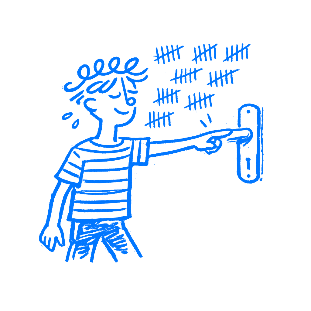
When the icon meant nothing
The hamburger menu. Three horizontal lines in a corner. When it spread through mobile apps in the early 2010s, designers called it intuitive. It was clean. It was consistent. It seemed obvious. Nielsen Norman Group ran a study with 179 participants across six live websites. The results were not ambiguous. Hiding navigation behind the icon cut discoverability nearly in half and made tasks measurably harder on both mobile and desktop. Users who had not yet built the schema did not see it as something to tap. It registered as decoration. Possibly a logo. Possibly nothing at all.
The icon only became workable through mass adoption over years. Enough products used it long enough that enough users eventually built the association. Even now, after all that exposure, visible navigation still outperforms it by every metric.
Designers who called it intuitive in 2012 were describing their own familiarity. Not a fact about the icon.
The one test designers skip
Stop defending design choices by calling them intuitive. The word has no information in it. What you mean is recognizable, and recognizable is earned through repeated exposure across many products and years, not granted by a decision you made last Tuesday.
Before you ship something you are calling intuitive, put it in front of someone who has never seen your product and watch in silence. No prompting. No explaining. No “just to give you some context.” Watch where they look first. Notice what they try to click. Every pause is a schema mismatch. Every wrong tap is an expectation your design violated.
Most designers skip this because they already know the design is intuitive. They know it because they built it. Which is exactly the problem.
You called it intuitive. You meant it feels familiar to you.
