Now you know too much
The ethics of designing with psychological knowledge
TL;DR:
The same psychology that reduces friction can manufacture it when it benefits the business. Defaults, loss aversion, progress bars, they point whichever way you set them. You now know exactly what each one does. Using them against your users is a choice you can no longer call accidental.
You got into design because you wanted to make things that work well. Things that help people. You liked the craft of it, figuring out what goes where, why something feels right, how a small change makes everything cleaner.
This is the last chapter. Forty chapters ago, you started with the idea that design is applied psychology, not a metaphor, the literal thing. Since then you’ve learned that you design for yourself by default and call it instinct. That deadlines narrow your thinking before you notice. That your first idea is a trap and your expertise is a blindfold. You learned that users don’t think in tasks, don’t remember your interface, don’t want your redesign, and will quit the moment they hit the same wall twice. You learned that the organizations designers work inside push bad work out the door through authority bias, groupthink, sunk cost, escalation, and metrics that have eaten the users they were supposed to track.
That is a lot of understanding about how people actually behave. And here’s what comes with it: the same understanding that makes you a better designer also makes you capable of real harm. Once you have it, you don’t get to pretend you don’t.
This chapter isn’t about psychology. It’s about what you do with it.
The knowledge was never neutral
B. J. Fogg spent years mapping out how technology changes what people think and do. He coined the word “captology” for it, computers as persuasive technologies. His 2003 book on the subject ends with a question that has aged into something uncomfortable: “Who will wield this power of digital influence? And to what end?”
“Who will wield this power of digital influence? And to what end?”
B. J. Fogg
Fogg asked that as an invitation to sit with it. What happened instead is that most of the industry picked up the tools and stopped asking. Defaults, framing, loss aversion, goal gradients, cognitive load, social proof, every mechanism in this book gets applied daily in products used by billions of people. Sometimes to help them. Sometimes not.
The knowledge about how defaults steer behavior is the same knowledge that turns an opt-in into an opt-out. Understanding loss aversion is how you design a reassuring undo button, or how you make it terrifying to cancel a subscription. Knowing that people are more motivated when they feel almost done is how you build a progress bar that actually helps, or how you manufacture fake momentum to extract another action before a user realizes what they agreed to. The psychology is identical. The direction is a choice.
What designers actually shipped
In 2018, GDPR came into force across Europe. For the first time, websites needed real consent before collecting personal data. The law was specific: consent had to be informed, given without coercion, and as easy to withdraw as to give. Designers across the continent got to work.
Researchers at Aarhus University and MIT (Nouwens et al., 2020) scraped the designs of the five most popular consent management platforms across the top 10,000 websites in the UK. What they found was not ambiguous. Only 11.8% of those sites met the minimal legal requirements for consent. The rest used dark patterns, design choices that directed users toward accepting cookies through friction, framing, and missing options. In a follow-up experiment with 40 participants, the researchers showed that removing the opt-out button from the first screen increased cookie acceptance by 22 to 23 percentage points.
Not a different message. Not better copy. Just making the no harder to find. The designers who built those consent flows knew about defaults. They knew about friction. They applied that knowledge against the people using their products because someone told them conversion rate mattered more. They did not hesitate, because the industry had made it normal.
This is not an edge case. This is what a significant part of the profession spent those years doing.
The line that isn’t sharp
There is no clean boundary where persuasion becomes manipulation. That’s what makes this hard. A progress bar that helps someone finish a real task is good design. A progress bar that manufactures urgency around a fake deadline is a dark pattern. The difference is not in the component. It’s in the intent behind it and the accuracy of what it communicates. Is this indicator reflecting something true? Or is it built to produce a behavior regardless of the user’s actual interest?
Harry Brignull named dark patterns in 2010 and spent years cataloguing them. Trick questions, hidden costs, confirm-shaming, roach motels, exits that are harder to find than entrances. The taxonomy helps. But what it sometimes misses is the gray zone where the pattern is not quite a trick but not quite fair either. A pre-checked consent box is obvious. A countdown timer that creates fake urgency is a little less so. An interface that makes the free plan so inconvenient that most people upgrade without choosing to, that’s somewhere else again.
You will work in that gray zone. The question is what you do there.
The only question that matters
There is no checklist for this. No framework that tells you where persuasion ends and manipulation starts. The only thing you have is a question you can ask before something ships: if the person using this knew exactly what I built here and why, would they feel helped or deceived?
Not annoyed. Not inconvenienced. Those are fine. Design has trade-offs and users don’t have to love every decision you made. But there’s a real difference between someone who understood what they agreed to and someone the design pushed past a choice they would have made differently if things had been clearer. You know which one you built. You knew while you were building it.
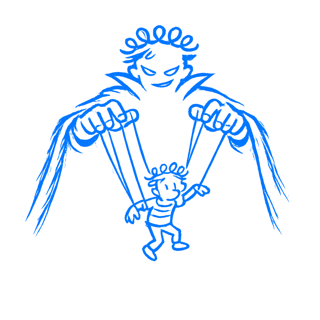
That’s the uncomfortable part about getting this far. You can’t really claim ignorance anymore. You know what defaults do. You know how friction shapes behavior. You know that hiding the cancel button is not just a layout decision. It’s a decision about whose side you’re on.
Designers have more psychological knowledge now than at any other point in the history of the profession. Used carefully, that knowledge produces things that are genuinely easier, less frustrating, and more useful. Used against people, it produces the kind of web most of us are tired of using.
The knowledge in this book only does one thing on its own: it shows you how much influence the job carries. Use it for the person on the other side of the screen and you make things genuinely better. Use it against them and you become part of the problem you started reading this to understand.
You know enough now. Use it well.